BRIEF
project summary
Built a calm, editorial identity for a real estate brand focused on premium listings. The system covered launch campaigns, hoardings, social media and brochures.
OVERVIEW
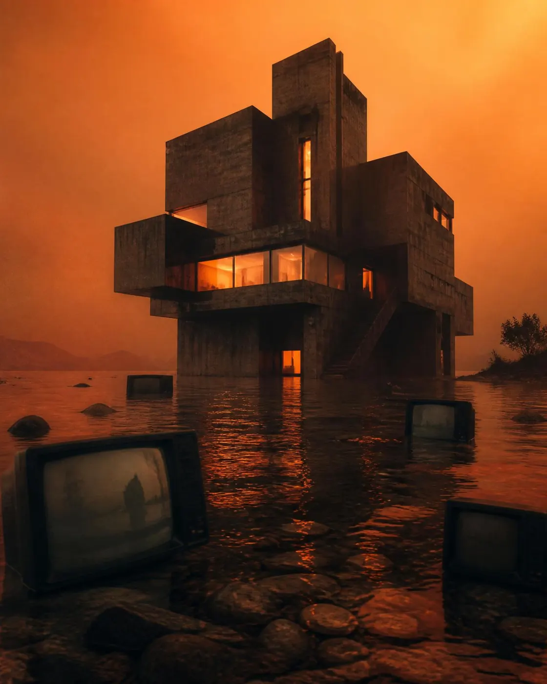
A property brand needed an identity that felt more like a magazine than a flyer. Architecture-led photography, generous whitespace and confident typography did the heavy lifting.
CREATIVES DELIVERED
Launch campaignHoardingsBrochuresSocial postsProperty reels covers
✦ DESIGN GOALS
- ✓Move away from the noisy real estate look
- ✓Make every listing feel premium and considered
- ✓Build templates the sales team can run themselves
✦ CREATIVE APPROACH
A muted palette, oversized editorial serifs, clean grids and a single accent colour used sparingly to draw attention.
DESIGN PROCESS
01
Audit of existing collateral
02
Identity system & moodboard
03
Print + social template library
04
Launch campaign rollout
the visuals